There was a time that each Church building, Meetinghouse, Stake Center and Temple was a unique structure, and, in many cases, very distinctive. 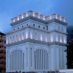 For a while now, in order to save money, the Church has been using standard plans for its buildings. Caveat alert: Once you get outside of North America, all bets are off on building design. They seem to be more unique, even the newer ones.
What’s interesting is that the leveraging of designs has really been going on since the 1950s. Prior to that, each building was designed and built from the ground up. Looking at the Temples, one can see a similarity in each era of Temple building.
Temples
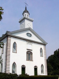
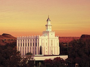
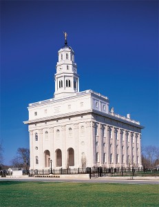
For example, the design of the Kirtland, Nauvoo and St. George Temples are similar, even if the interiors had a totally different configuration.
Similar Designs Examples
- Logan, Manti
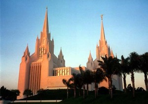
- London, Hamilton, NZ, Bern, Los Angeles
- Ogden, Provo (For now)
- Tokyo, Seattle, Jordan River
- Sao Paulo, Atlanta, Santiago, Tonga, Samoa (original), Tahiti, Sydney, Denver
- Boise, Dallas, Chicago, Manila, Taipei, Guatemala City, Johannesburg, Stockholm, Seoul, Lima, Buenos Aries, Frankfurt
- Small Temple Designs
- Etc.
There, have of course, been some unique ones along the way:
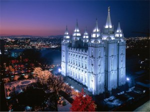
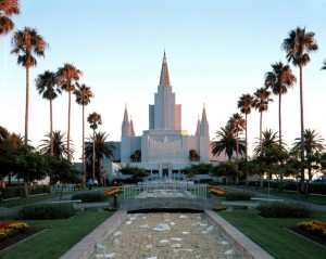
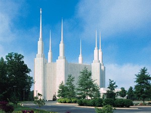
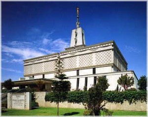
Salt Lake, Oakland, Washington DC, Mexico City, San Diego, to name a few.
Meeting houses and Stake Centers
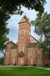
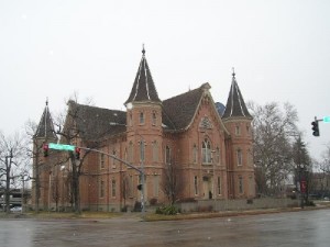
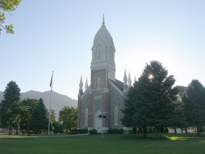
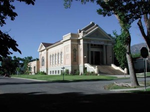
In the early days of the Church and in many parts of the world still, existing buildings were and are re-purposed for use as meetinghouses. In some cases, buildings are just rented for Sunday use. As the Church became established, starting in Utah and surrounding states, LDS Church buildings were built to match the specific use for the facility. Very ornate Tabernacles were the center of a Mormon town.
Here are a few examples:
Paris, ID , Provo , Box Elder (Brigham City) , Kaysville
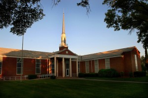
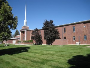
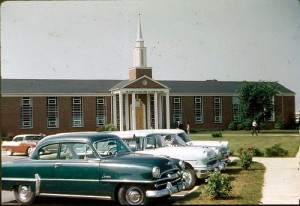
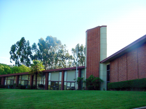
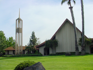
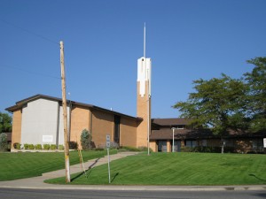
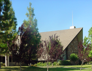
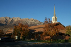
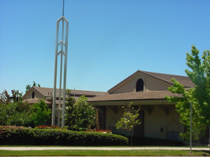
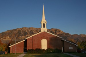
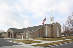
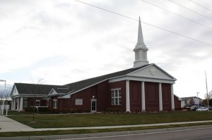
As time moved on, standard designs began to become the norm. As far back as 1950s, many meetinghouses and Stake Centers were based on the same design, with an occasional unique one.
1950’s
1960’s
1970’s
1980’s
1990s, 2000s
The 1990s brought the “California Plan,” a 42,000 sq foot 2-story building designed to hold an entire stake within it. There are two of everything, Chapels, Primary, Relief Society rooms. Eight bishops and clerks offices and a complete set of Stake offices. Most of the buildings were and are not fully utilized except for short periods of time while other buildings were renovated. Take it from my personal experience, you’ve never experienced this kind of organized chaos when you have four wards in the building at once, 4 in the morning and 4 in the afternoon.
So, what do you think? I’ve heard that they are even tearing down some of the older, unique buildings to put up more efficient, newer designs. Are we losing the character of our buildings by having the same designs? Or, is it easier to find a church building? I’ve always been able to spot our buildings by the spires out front.
Are you in a vintage building or a cookie cutter building? Which are your favorites?

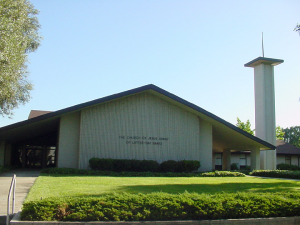
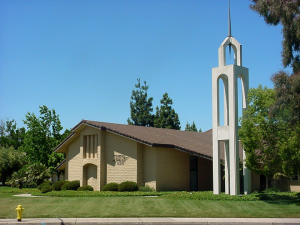
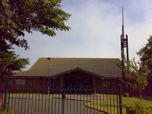
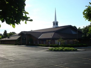
Comments 37
Hmmm. Both have their advantages. The building I grew up attending was not standard, but it wasn’t an architectural marvel either. To some extent, it was built over time as money allowed (based on ward budget which was contributions of local ward members), added to as needs dictated, and conforming to the plot of land that was available (which was on a hill, so half the building is two levels and the other half is just one level. It went from just a chapel, library, a few classrooms and a font to include a full size gym and hardwood stage, a kitchen, more classrooms, and lastly a junior Sunday School wing, and an addition wing of classrooms. While I love the building for my own associations with it, and it does have some great features, it’s also a real hodge-podge of rooms and there’s not great “flow” through the building. The new designs are clearly much more functional.
My branch when I was active is in a store front, I’m wondering now that Philadelphia is getting a temple weather or not the temple grounds will hold a stake center and thereby have the branch move to that location.
It’s funny…1960’s picture # 2 is my building. I heard once that the transition from the 1960’s style of 4 corridors coming off a chapel (upside down turtle) to the rectangular ring hallway styles from the 80’s forward saved $3000 (in 1980’s real estate value) per corner eliminated from the design and that the savings was in part being used to build chapels internationally in places where the church was being newly established. That seemed justified to me. The chapel of my childhood was recently torn down, after being owned by another organization for years. It had one chapel that was made out of adobe by early settlers, than a newer chapel was added and the old one was used for primary and jr. Sunday School. A cultural hall and stage were added. It was a bit of a mishmash and didn’t really have architectural value worth saving. If I was a multi-millionaire, I would have loved to have saved the original adobe chapel and rebuilt all of the accessories around it. Those adobe blocks represented an effort of love.
I do remain somewhat partial to the Arizona chapels of the 40’s and 50’s that have a rectangular center-core outdoor courtyard surrounded by a ring of classrooms that open to the courtyard. Something about the natural light and garden landscaping that you enjoy during your breaks made those buildings special. With the church landscape employees being cut, I don’t think the gardens could be maintained by busy LDS families. I also think the Hawaiian style chapel where large panel doors along the outer chapel walls can be opened to let the light and fresh air in are super-cool.
They both have their own charm: the unique ones are sometimes charming in their own way, but the new ones are easy to spot, very functional, and fairly attractive. Also, if you’ve been in one newer one and visit another, you’re not likely to get lost: navigation within is a snap.
The chapel I grew up in was one of the ones pictured above (the last one from the 1950’s). I always thought it was kind of a weird building–within and without, but it worked. At the time it was built, the local members had to raise most of the money and contribute a great deal of the labor, so it took a year or more to complete. A lot of the members therefore had a strong attachment to it, but now most of them are dead. I don’t know how I’d feel if it were torn down and rebuilt–I don’t live there any longer and it wouldn’t impact me much.
The one we’re attending now is another older, unique one. It’s not “charming” in any sense of the word: just old, ugly and squat. I wish they’d tear it down and replace it! But the Church just refurbished it, so the chances of that–at least anytime soon–are next to nil.
The Church is also experimenting with “low-carbon footprint” buildings that use solar and other renewable source for some of their power and don’t draw nearly as much from the grid as standard buildings. From what I’ve seen, they look just like regular ones; they just have solar panel shingles instead of regular ones. I don’t think the Church will build all new chapels this way, but it sure is innovative. Do you know of any other church that builds “green” chapels?
So my stance is, the new, standard chapels are fine. If an older one is aesthetic, sturdy and functional, keep it. If it’s ugly or weird–or both–tear it down and replace it!
When my dad’s childhood chapel was built in 1957, a member of the ward bishopric reportedly “went to Salt Lake and leafed through the plans in the Presiding Bishopric’s Office until he found a functional one that could be built on the available lot.” It’s identical to #3 in the 1950s row. When our current chapel was built 2 years ago, the Stake President picked the plan (and chose a building that’s far too small)
Part of the change in architecture is changing views of what’s acceptable in Mormon churches. They used to have “funeral doors” at the front of the chapel that opened directly to the outdoors to make it easier to get caskets in and out. ( #2 on the 1960s row is a great example). Now church policy strongly discourages dead bodies in the chapel (use the relief society room!) so a 360 degree racetrack is possible.
Similarly, the gym (ahem, “cultural hall”) used to be relegated to a separate building. Eventually, shorts in the church proper became acceptable, and it was moved inside the racetrack next to the chapel.
From a financial standpoint I totally understand the Church using a standard design and then allowing for local aesthetic changes like color, materials, and other extras. The Church builds an average of over 1 building a day (something like 400 per year) so designing each new building separately from scratch would be incredibly costly. From an exposure standpoint, it makes the buildings very familiar to members and also recognizable to outsiders. It’s in the western US where we see the “cookie-cutter” problem since there are so many so close, sometimes two virtually identical buildings sharing a parking lot (see the two chapels along I-15 adjacent to Idaho State University!). Out here (Ohio) the buildings are so spread out, no one would ever guess there are other buildings like them!
Some of the older designs do have advantages over the newer ones. Not only in airflow (like I love how our chapel actually has windows we can open!), but in security too. Our building is a “phased” building that was two main wings in addition to a chapel, overflow, and gym. Primary is all its own end of the building, which makes security pretty easy as the only way to enter the building from the parking lot is on the opposite side and everyone in the “Primary Wing” are people we know should be there. At my sister’s ward in Utah, a brand-new building, Primary is literally right around one of the entrances (two classes right off the foyer), so security is much tougher to maintain.
Also, much of the older part of the building was actually built by members and “building missionaries”. Many of these members are still in the ward, so we definitely have a deep attachment and commitment to the building to maintain it and keep it nice. Even then, while our building has some unique aspects, but is a standard design from the 1960s and I’ve been in nearly identical layouts elsewhere. Certainly made things easier to find!
My ward uses a unique building in a unique neighborhood that is 16 years old. The developer was a Latter-day Saint and he donated the land with the requirement that the building had to match the development. It’s a very lovely building. Something I’ve noticed though is that the upkeep is a bit below the norm, as though it doesn’t quite fit the PM group’s checklist. Standardization seems to help the church economize not only with design and construction, but also with maintenance.
“Now church policy strongly discourages dead bodies in the chapel (use the relief society room!)”
Why is that, I wonder? Too much like what the Gentiles do, and lesser breeds without the Law?
I have no idea, but having the casket parked under the podium during the funeral services is now a bygone relic. Maybe church authorities want the chapel reserved for the actual funeral service (which Elder Packer says should be a formal, authorized church service), and keep the more informal viewing and wake in other, less sacred areas of the building? I don’t know; that’s just a guess.
The building where I was baptized was built largely by members in the late 50’s or early 60’s in Pittsburgh — strange building perched on a typically strange Pittsburgh intersection with a steep hill on one side of the property. Later it was expanded to accommodate a much needed stake wing and added Primary room — not architectually lovely, but still functional, to be sure.
I like the fact that some of the older buildings are being repurposed for temples.
I know this isn’t a post on acceptable funeral and wedding practices in the chapel, but I find church prohibitions on certain issues weird, harsh, and ridiculous. what is with the banning of a casket or weddings in a chapel? why can’t we take photos in the chapel or record funeral proceedings? I don’t get it.
I understand the need for cookie cutter churches, but I really like some of the older churches with cool stained glass windows. of course the hard benches and lack of air conditioning are a turn off….
#9 — By all means, have the viewing (Mormons can have wakes? Cool!) in the Relief Society room. But is it really policy that you can’t then bring the casket into the chapel to be present during the funeral service? What’s a funeral without a body?
#12 Thomas — I have the same question. I’ve been to two funerals this year, both with closed caskets in the chapel for the service. (Attendance at both was far too many to fit into the RS room.) I’m not aware of this policy, nor is my bishop or stake president, apparently, as they were both present.
We (in New Haven, CT) have a very unique building, 5 story building which used to be an apartment complex for old single women in the early 1900’s. It’s great, and yet terrible at the same time. We’re told by FM that your building is huge, but because of all the extra space for toilets on each floor, stairwells, elevator, there aren’t enough classrooms, and no cultural hall either. To top it all off, we’re not allowed to bring children up to the top floor either. It has really shown FM in a bad light, and will be nice when they get off their power trip. They told us that a closet (6 feet by 2.5 feet) is large enough for a primary class to meet. Oh, and the roof in that room is about 5 feet 10 in high.
So, I wouldn’t care if our next building looks like a cookie cutter, but please let it have enough classrooms and a gym.
Having said that, I wish we put more beauty into our daily worship centers. We put effort into the Temples, which is great, but I don’t go there regularly. I want to see and feel a sense of pride and awe and wonder where I worship, and most of the basic cookie cutter buildings don’t fit that bill.
@14 “I want to see and feel a sense of pride and awe and wonder where I worship” and you want a gym. Maybe the Marriott Center will fit the bill?
Well, last year I spoke at a funeral in an LDS building with a hall wrapping around the chapel and no direct door to outside the building. The casket was brought into the chapel for the funeral from the Relief Society room where the viewing was held, same as ever. And I have a recording of the funeral that the funeral director provided me.
This was my chapel when I live in San Jose (San Felipe building, represent, y’all!) It is the coolest of all meetinghouse designs. Two gyms, two kitchens, etc, it was a sight.
It is sad that it was once in full use by many wards, but the mass exodus of saints out of California (especially Bay Area) has taken it’s toll. When I left, there were 2 wards and sometimes an additional branch in that building, and they had already converted all the stake offices into a large family history center.
#11 — The La Canada, California chapel used to be (I think) an Episcopalian church, and it looks it: wood-beamed ceilings, stained glass, & all. I love it.
View Larger Map
Evidently the stained-glass window in the chapel — which honestly does have a really Papist-looking, slightly effeminate Jesus, and an overall smells & bells aesthetic — nearly bit the dust. The story is that they finally chose to keep it (it was really to beautiful to do anything else), but added in some glass tiles with scrolls labeled “Stick of Judah” and “Stick of Joseph” to Mormonize it up a bit.
Author
N. #17, The picture is actually the Scott Creek Bldg, but it was pretty much the same as San Felipe only the architect didn’t put the kitchens in the wrong place! We lived around the corner from the San Felipe Bldg. I was responsible for the keys of the building and making the schedule when we were fully occupied with 8 wards at one time when two buildings were down for renovation. it was a challenge!
I like the glass block (reminds me of Florida where I grew up) in the Relief Society room at our meetinghouse (Garfield Buidling, Carmichael, CA).
LDS facilities tend to be like military construction, especially military housing. Anyone remember Wherry Housing? Anyway, we have trends which produce a sameness during a construction period which tends to give away the building’s age.
BTW, I miss the old Echo building in Fresno, across the street from Fresno High. It had that 1930’s quantiness to it. Sure, the replacement looks nice, but…(sigh)
I use to work across the street from a chapel and all my coworkers use to wonder why there were no windows and crosses.
john mansfield, i’d like to see your video of the funeral. (my guess is that you don’t have one-that is my point.)
#5/9 Clark, the talk in which Elder Packer spoke about funerals being “church meetings” was from Oct 1988 Conference in which he quotes a 1972 Priesthood Bulletin. In that bulletin, it’s recommended that funerals conducted by the priesthood be like sacrament meetings in that they have hymns and prayers and appropriate talks. He then addresses a practice of an open casket and an expectation that members are to pass by that open casket after the funeral (I actually conducted one like this a number of years ago; the stake presidency counselor in attendance did not object). But he does not state there that a closed casket may not be in the chapel for the funeral.
Still interested in further documentation that there should be no casket in the chapel during the funeral.
Sorry in #23 I should have clarified: Elder Packer counseled against the practice of filing by the open casket at the end of the funeral…
I grew up in a ward that had a beautiful old pioneer building in Salt Lake (which is still in use), and I have never liked the cookie cutter buildings, but could understand why they were used. It wasn’t until we moved to Montana nine years ago that I first attended in a building where the chapel has no windows–soooooo depressing and in no way inspirational.
And as for no bodies at funerals? I’ve never heard of that, and my husband, who is in our stake presidency, is a very by-the-book leader when it comes to funerals (which is why I have left very specific non-by-the-book instructions for my own in my will; it might have to be held at some location other than an LDS meeting house).
From an exposure standpoint, it makes the buildings very familiar to members and also recognizable to outsiders. kind of a feeling of comfort while traveling.
On the other hand, I really enjoyed the Alhambra building while going to CSULA and the old building in Anchorage where 1st and 3rd wards met, and the 3rd and 18th ward building in Las Vegas (now no longer an LDS chapel due to neighborhood shift).
Familiarity… when I moved to Colorado, I was delighted that the original Longmont and Loveland buildings were viscerally familiar for resembling my childhood church home in Indianapolis on Stop 11 Avenue (all three were 1960s vintage). It was like I instinctively knew where the Primary, the Kitchen, and the secret storage spaces (including where to find band-aids) would be.
Unfortunately, people who haven’t experienced the 1960s vintage buildings hate hate hate them, because they don’t know where anything is, and there truly is no logic or reason for the placement of anything.
The newer Longmont Stake Center was the first Legacy building built, completed in 1991. We quickly learned that 1) the nursery is too small, though the tiny toilet was cool, and 2) the hallways were mega too narrow. I guess they got it figured out because the Church has made lots of the Legacy buildings. It freaks me out to see bazillions of ’em in Utah County. So weird.
I think some great points have been brought up here. Newer buildings have a certain functionality and practicality as well as cost saving measures to them, but at a loss of a local unique charm and feel. Personally I would dig some more variety in the interior with stained glass, and leave the exterior alone.
I grew up in Los Angeles and there is definitely a mixture of older meetinghouses and newer ones depending on where in the area you find yourself. The La Canada, Mar Vista, and San Pedro buildings are pretty unique, some have already been mentioned. There was a large outdoor patio area in the building I attended growing up, and I don’t think I’ve seen one since. The Inglewood Stake Center had a very unique design. As a kid it was a great place to play hide and seek with two or three floors. The Carson building has two chapels.
We have a 1950’s, built-by-members building with two stories and odd little add-ons–charming, but with really terrible flow. It was renovated a year ago, losing the stage (and two secret staircases) in order to gain more classroom space. I think it says a lot about us as a people when our “cultural hall” loses a vehicle for culture.
Church buildings here are extremely boring architecturally although they do have one good feature, namely they are well designed for social functions, and sports.
However, it’s annoying that to get baptised you change in the toilets. Doesn’t wash really, in more ways than one!
Interesting. My son and I took several of these pictures for his Eagle Scout project many years ago. How did you come across the CD?
The Mexico City temple is not unique in floor plan, although its exterior is definitely unique. The floor plan and interior architecture is virtually identical to the Seattle Washington temple which was dedicated a few years earlier (1980 vs. 1983). After going to the Seattle temple for close to 20 years I was looking over an article about the recent renovation of the Mexico City temple: it was amazing how much it looked like the Seattle temple. I then sought out a few friends who go to Mexico frequently and they verified what I saw: they are the same floor plan and very similar in interior design.
Author
31 Organist,
I had them at the time as a result of my calling in San Jose. please email me at jspector106atmsn.com and i can fill you in.
Leedo,
Not a surprise. I’ve been in both Temples and they were built in the same era. I think Tokyo is the same as well. The escalators kind of freaked me at.
A lot of the churches, hell even the houses in Utah are Cookie Cutter nightmares. The older unique buildings in Salt Lake City and Ogden, Utah put all these clone houses to shame. I drive up through each town and see nothing but cookie cutter homes and apartments. It is so boring and tiresome. Utah has a lot of upgrading to do.
I could easily mistake one town for another.
Some years ago, I wanted to show a friend from Texas the Logan Temple. As we drove by, I was horrified to see that the building had been totally gutted. The roof, walls, floors, everything was completely gone. The only thing left standing was the four walls.
I was crestfallen. My Great Grand Father had sacrificed and struggled to help build that structure. I had gotten my endowments from there. The &%@#$% building committee had destroyed the evidence of faith of my ancestors. That destruction was another nail in the coffin, that drove me from the church for 17 years. I still will not go back to that temple. A Marriott hotel redo of the insides will just be salt in the wound.
This article is a very interesting read. I’ve always liked the LDS meetinghouse architecture and take pictures of the various chapels I come across as I travel. I started a photo album of them if anyone would care to view it
http://farmall.smugmug.com/LDS/LDS-Meeting-Houses